Weave & Muse : Inclusive Fashion Case Study
Background.
Weave & Muse is a case study of a popular fashion retailer that needed website designs for it’s first foray into e-commerce. They strive to make fashion that is accessible and affordable. I designed their website prototype with the express purpose of creating an inclusive fashion site. To this end, the site does not have gendered clothing categorization and there is also a diverse range of sizes, races and gender expressions represented.
My Main Objectives.
To make a new logo that evokes quality, inclusivity and modernity.
2. To create an accessible e-commerce website prototype with seamless usability that gives all customers an inclusive and frictionless shopping experience.

Research.
Direct Competitor Analysis.
Since Weave and Muse is an affordable and popular retailer, I examined other clothing retailers with similar pricing and popularity. Needing to understand how to present gender-free clothing, I also looked at some online retailers that do not gender their clothing. As well, I researched current fashion e-commerce strategies and trends.
Through this research I discovered lots of valuable information about what make fashion e-commerce successful. My main findings became features of the Weave & Muse prototype. These include: free shipping & returns, product videos, easy favouriting, detailed filtering, inclusive sizing, pictures responsive to a hover state and reviews with user submitted pictures.
Primary Research.
For primary research testing, I sought out participants with a range of different gender expressions who regularly shop online at competitors’ websites. I knew that their experiences shopping for gender neutral clothing would provide valuable information to help create a more inclusive and accessible site.
Participants.
Four people
All gender minorities
25 -41 years old
All shop online regularly
All shop at direct competitors
Method.
Zoom video call
User Interview: User answered questions while I took notes and recorded
Contextual Inquiry: User shared screen while they shopped at a direct competitor of their choice
I collected a lot of valuable information from user testing. The most effective part of my test was the contextual inquiry, where I watched users as they shopped for clothing at a competitor’s website and asked questions about their process. Some of the key findings are below.
Users want filters to be effective and simple.
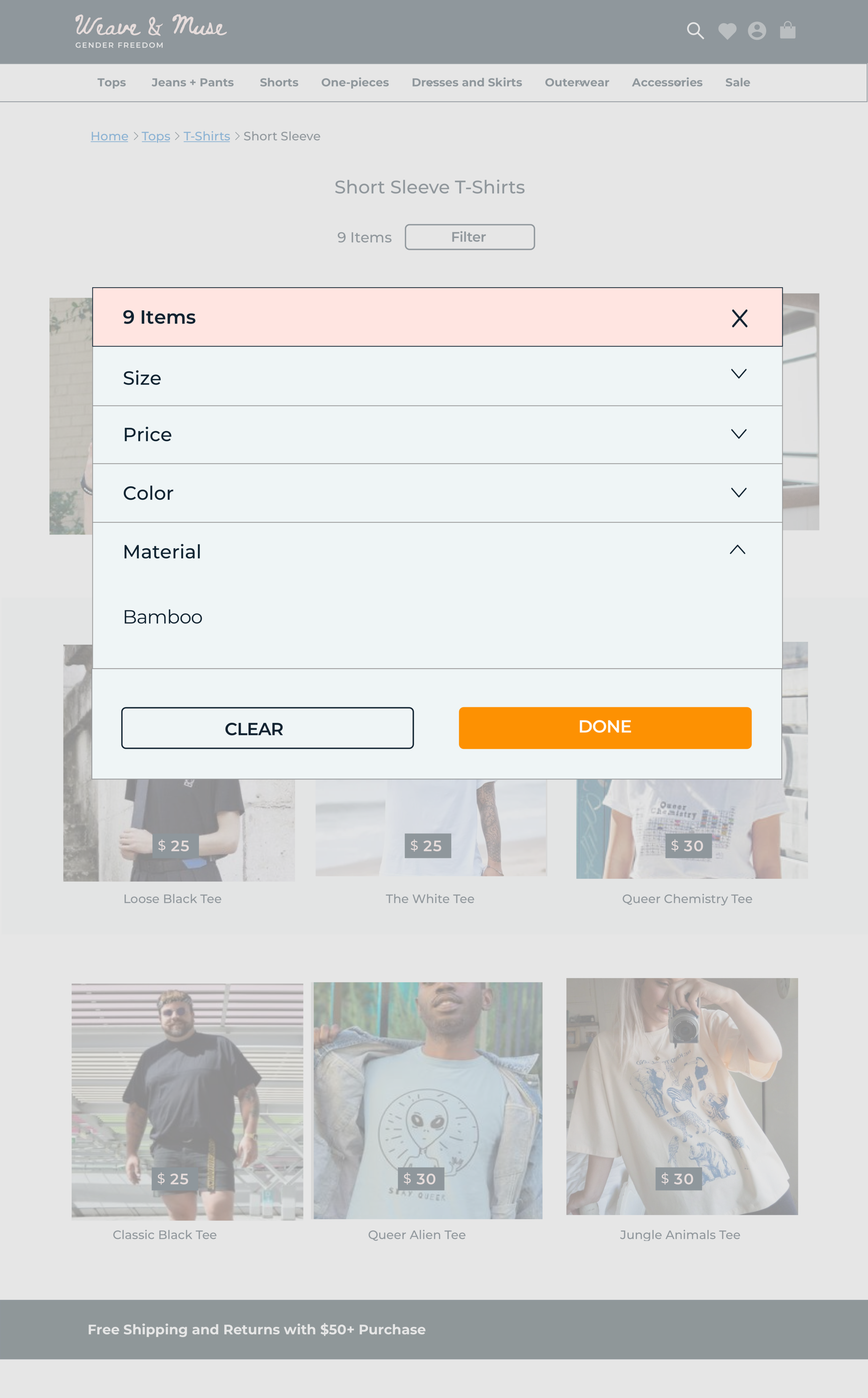
The filters in clothing listings needed to be well thought out and clearly labelled. I made size, price, colour and material categories.
Users feel most secure using online shopping for basics.
I highlighted basics on the prototype. These are easier for a greater amount of users to see themselves buying.
Users complained about images of clothing on retail sites not giving them a clear view of what the clothing would look like on them.
Images were used that show clothing at multiple angles in full body shots with model measurements listed. Images of different body types wearing the same item were also included.
All users talked about the inaccessibility of the mainstream competitor’s websites for their specific gender expressions.
I integrated a lack of gendering of clothing throughout Weave & Muse. This includes clothing categorization, sizing and diverse imagery.

Empathize.
Persona.
I applied the information taken from user testing to create a persona of the Weave & Muse user. I used the persona to empathize with user needs and to keep those needs at the front of my mind for the entire design process.
Empathy Map.
In order to understand the perspective of my user persona, I mapped out their feelings, actions, and sensory perceptions. I also focused in on what their specific pain points and needs are. Referring back to this during the design process helped further steer my decisions with clear user needs and wants as my guide.

Define.
Card Sorting
Since Weave & Muse does not have gendered categories, I needed to focus in on making sure their retail items were categorized in a way that is both intuitive for all users. In order to do this, I conducted remote cart sorting tests in which six users created categories for the thirty clothing item cards I gave them. They were encouraged to go with their first instincts for the category creation and sorting. The test results greatly informed the categories used in Weave & Muse navigation.
No users created gendered categories.
Gendered categories are not central to clothing categorization.
Two users combined multiple terms (Skirts and Dresses).
Combining clothing items that are similar into one category simplifies navigation.
Two users used activities as categories (Work/Party/Active etc.).
Users appreciate the option of being able to look for clothing by activity.
Two users created overarching categories ex. Tops, Bottoms.
Using Tops or Bottoms as categories can simplify navigation fo a number of garments.
Task Flow.
In order to gain greater understanding of the information architecture of Weave & Muse, I created a task flow. This revealed in what order different aspects of the site should present themselves to the user. It also helped solidify what the website response should be to user actions.
Site Mapping.
With the card sorting tests and task flow done, I had a very clear idea of what the information architecture of Weave & Muse would be. This was laid out in a sitemap so that I could easily refer to it while creating wireframes.

Design.
Low Fidelity Wireframes.
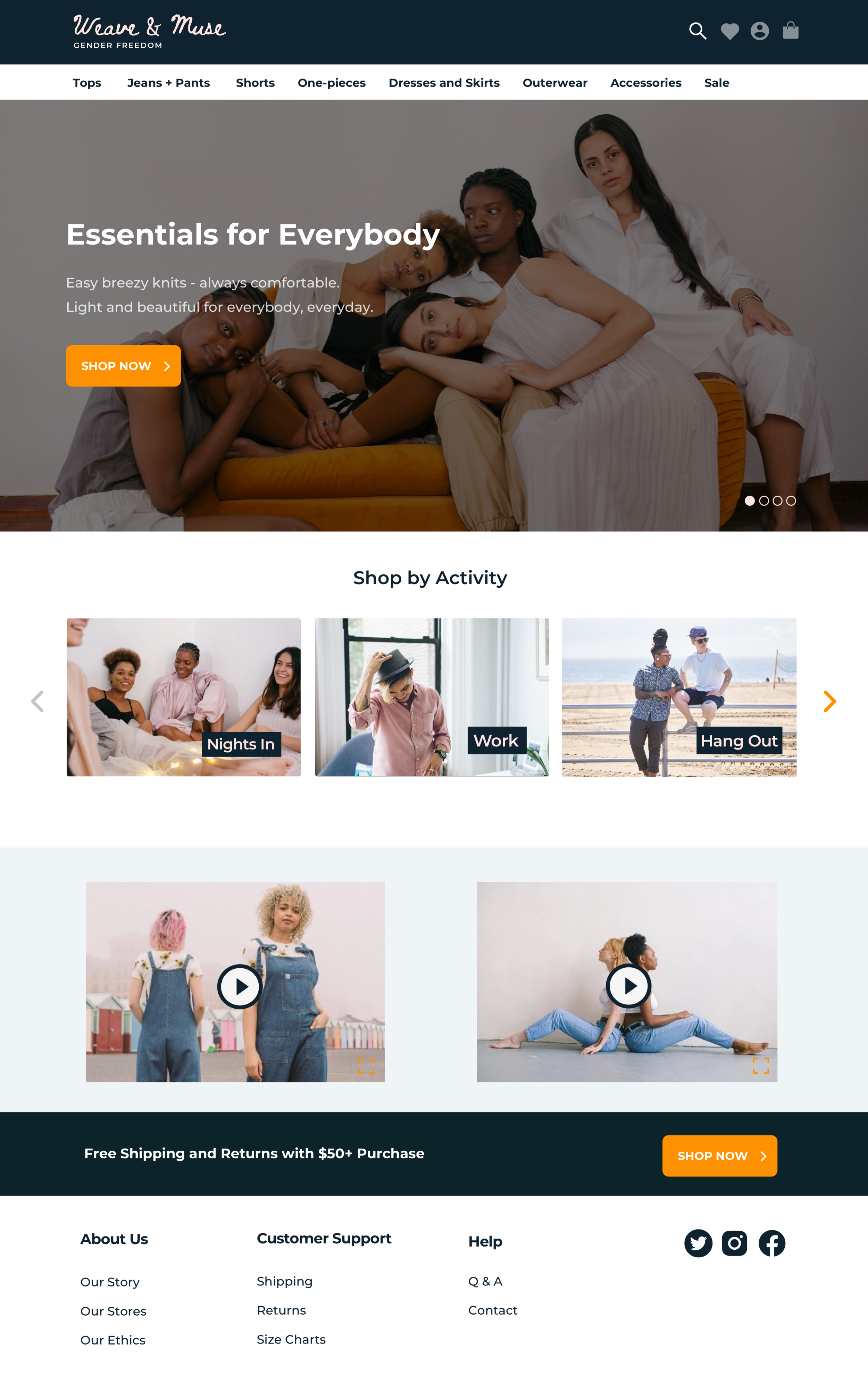
I created responsive lo-fi wireframes for desk/laptop, tablet and mobile. I focused on the most screens that would be needed for a user to find clothing and add it to their cart. This includes; a landing page, a listings page and a product page. All the features on the wireframes were the result of primary and secondary research.
Landing Page
Desk/Laptop
Landing Page
Mobile
Landing Page
Tablet
Product Page
Desk/Laptop
Listings Page
Desk/Laptop
UI Kit.
Next I designed a UI kit for Weave & Muse. I wanted to create a clean and contemporary aesthetic that was classic at the same time, evoking both modernity and the tradition of hand crafted clothing. For the logo this was done by combining a hand-written style font (Beth Ellen) with a modernist font (Montserrat). I added the phrase “Gender Freedom” below the brand name in order to immediately communicate the brand’s core value. I chose a colour that evokes classic style (navy blue) with the softness (evoking soft, high qualilty material) of a very light pink. The pink and blue combination is also about the mixing of femininity and masculinity. The orange highlight compliments and stands out from these colours.
High Fidelity Wireframes.
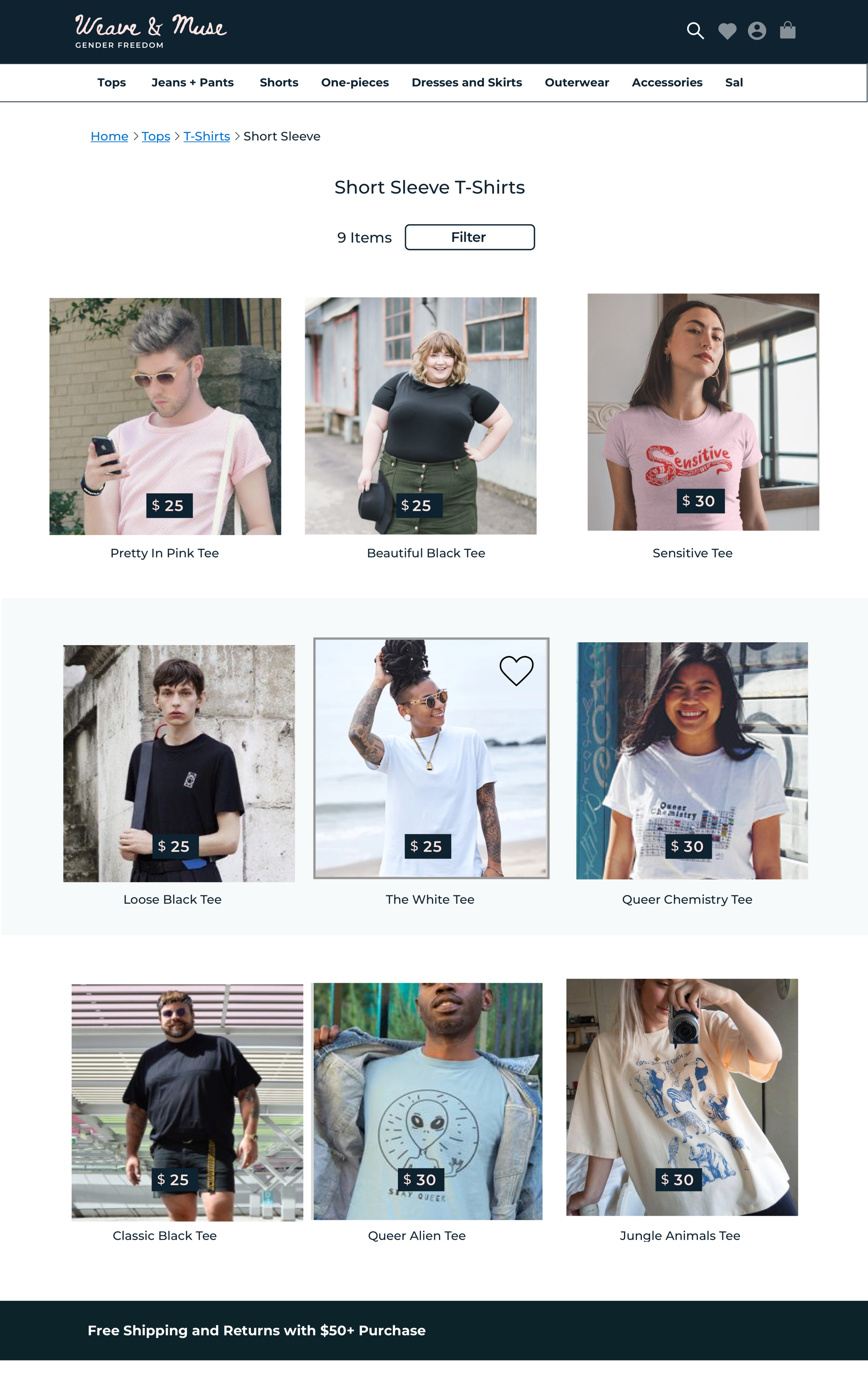
The next stage was to apply the UI kit to the wireframes. I ensured all of the images used reflected the brand colours and used similar lighting. I also made sure to represent varied gender expressions, races and body types. This was important for the essence of the brand to be communicated to users participating in the next round of testing.
Landing Page
Listings Page
Product Page

Prototype.
User Testing.
I created a clickable prototype that would approximate the experience of finding a clothing item and adding it to a cart. Users that were tested had to complete a task to see how intuitive the website navigation is. They were also asked to explore the prototype outside of the task.
Participants.
Four people
All gender minorities
28 - 40 years old
All shop online regularly
Method.
Zoom video call with user sharing their screen
Task test: Asked user to complete the task of selecting an item and adding it to the cart
Contextual Inquiry: The user explored the prototype and commented on their experience with the different features. They added additions and changes they would like.
The task test and contextual inquiry proved to be very effective in finding what was working and what needed to be changed about Weave & Muse. Some of the key findings are below.
On the clothing listings page, users tried to first click anywhere on the product card before clicking on the ‘Shop Now’ button on the card.
The entire product cards were made clickable for a redirect to product page. The ‘Shop Now’ buttons were taken off of all product cards.
The size chart that fit on the product page was not detailed enough for users to understand and also made the page too crowded.
The size chart on the product page was deleted. Instead, a link to a pop up size chart was added to the product page, with a more detailed and clear size chart on the pop-up.
Once users clicked a button to add an item to their cart, they weren’t sure if they were successful.
A pop-up was added to make obvious that the user had added an item to their cart.
Final Prototype.


