Gaggle : An End-to-End Queer Meetup Application
Background.
Gaggle is an end-to-end app project created to bring LGBTQIA+ people together through local activities & events. Originally this was intended to be a travel app, connecting people with locals to help explore off the beaten path. After realizing that many locals struggle with both making friendships and knowing what to explore in their cities, I decided to pivot the app to local users.
I focused the app on queer users in particular, as it’s generally harder to find friends and events for minority groups. For LGBTQIA+ people, knowing that activities and events will be safe and welcoming spaces can remove barriers to friendship and social activity. Through common interests, fun events and activities and community organizations, Gaggle aims to help the queer community explore their own backyards, meet new people and make lasting friendships.
My goals became clear. I needed to:
1. Create an end-to-end application that makes the process of looking for and finding events more accessible and fun.
2. Make a design that makes the difficult task of meeting new friends easier for queer adults.

Research.
Direct Competitor Analysis.
My first step was to examine what already existed in the market. There were multiple defiencies in all of the platforms I surveyed. This included ineffective filtering, unattractive UI, lack of queer-centric platforms and friendship-creating focus.
Next, I needed to see what queer people were having issues with in making friends and finding queer events. I needed to find out what they wanted from the Gaggle platform.
Primary Research.
I looked for LGBTQIA+ people who had been newcomers in a major city for user testing. Although the app is not exclusively designed for LGBTQIA+ newcomers, I felt this group would have the highest difficulty trying to find local events and make friends. Accommodating those with the highest needs would effectively include and improve the experience of those with less acute pain points.
Participants.
Four queer people
All have been newcomers in a major city
All have looked for and joined activities for the purpose of meeting queer friends
Method.
Zoom video call
User Interview: User answered questions while I took notes and recorded
Contextual Inquiry: User shared screen while they looked at a landing page mockup for Gaggle.
User Testing Affinity Map
I organized all the information into an affinity map, using different colour notes to represent each participant. I then put together different categories stemming from the similarities in the user’s comments. This process helped me determine solid evidence for what users were missing from other platforms and what they needed from Gaggle.
While I found that much of the information I had from my own experience and my secondary research was correct, user testing also uncovered crucial information that I had not thought about.
Users complained of competitor platforms being inadequate for their needs. The most cited problem was Facebook’s lack of event filtering.
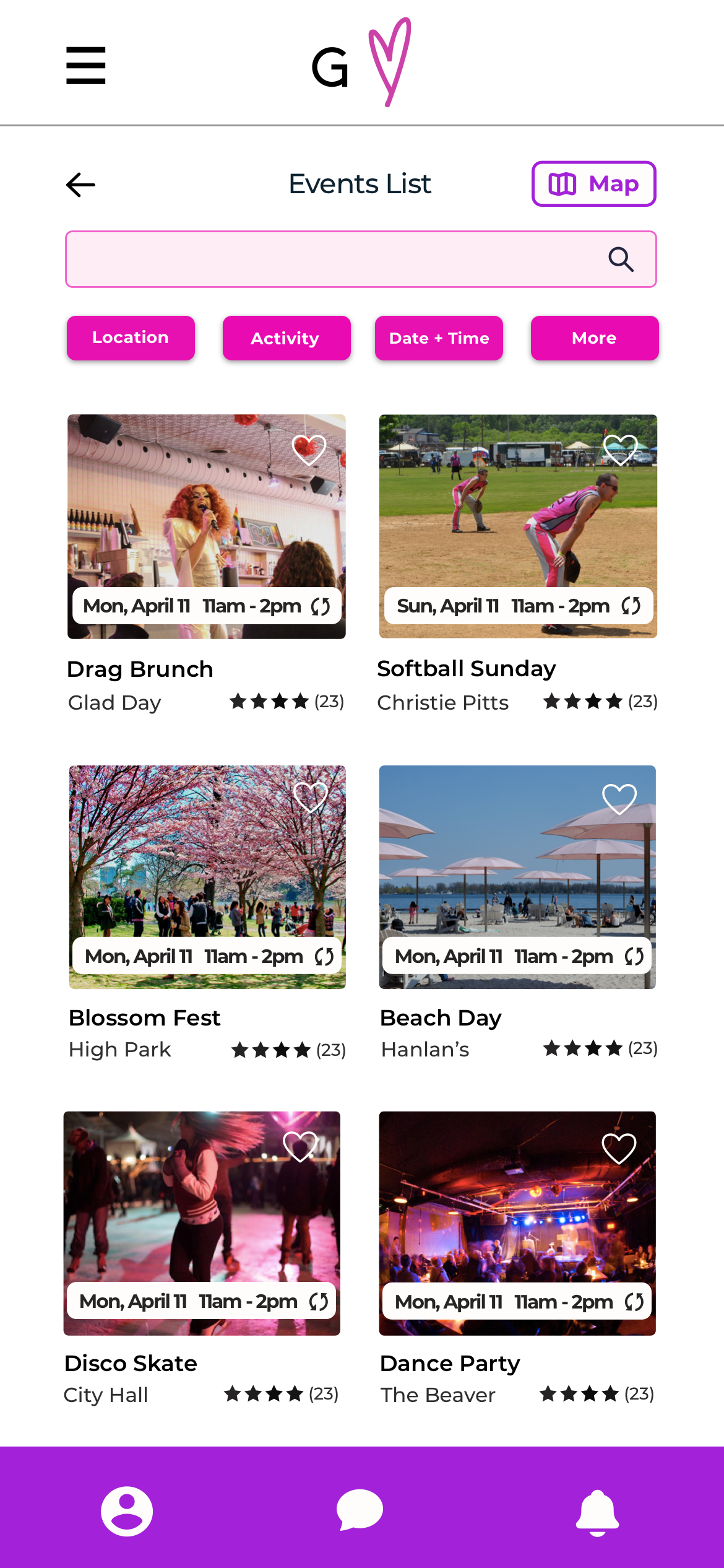
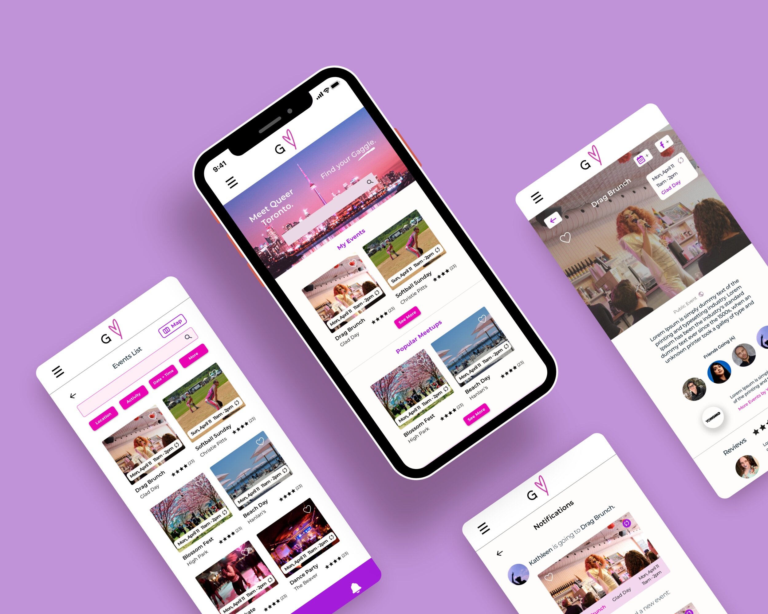
I incorporated comprehensive filtering in event search pages. This includes, proximity to the user, locations, time, frequency, organizers, venues and activity types.
Users complained about the inability to favourite events on event platforms. Users also wanted detailed reviews of events.
I created intuitive favouriting on event lists and pages, as well as a Favourites section. This includes starred ratings on event listings and more detailed written reviews on event pages.
Easy integration with Facebook events would motivate many to use Gaggle.
I added a button to add any event to the user’s connected Facebook calendar.
Users want to be able to see user profiles, and be able to friend others and see who is going to an event. Messaging and chatting with individuals to solidify friendships is important to them.
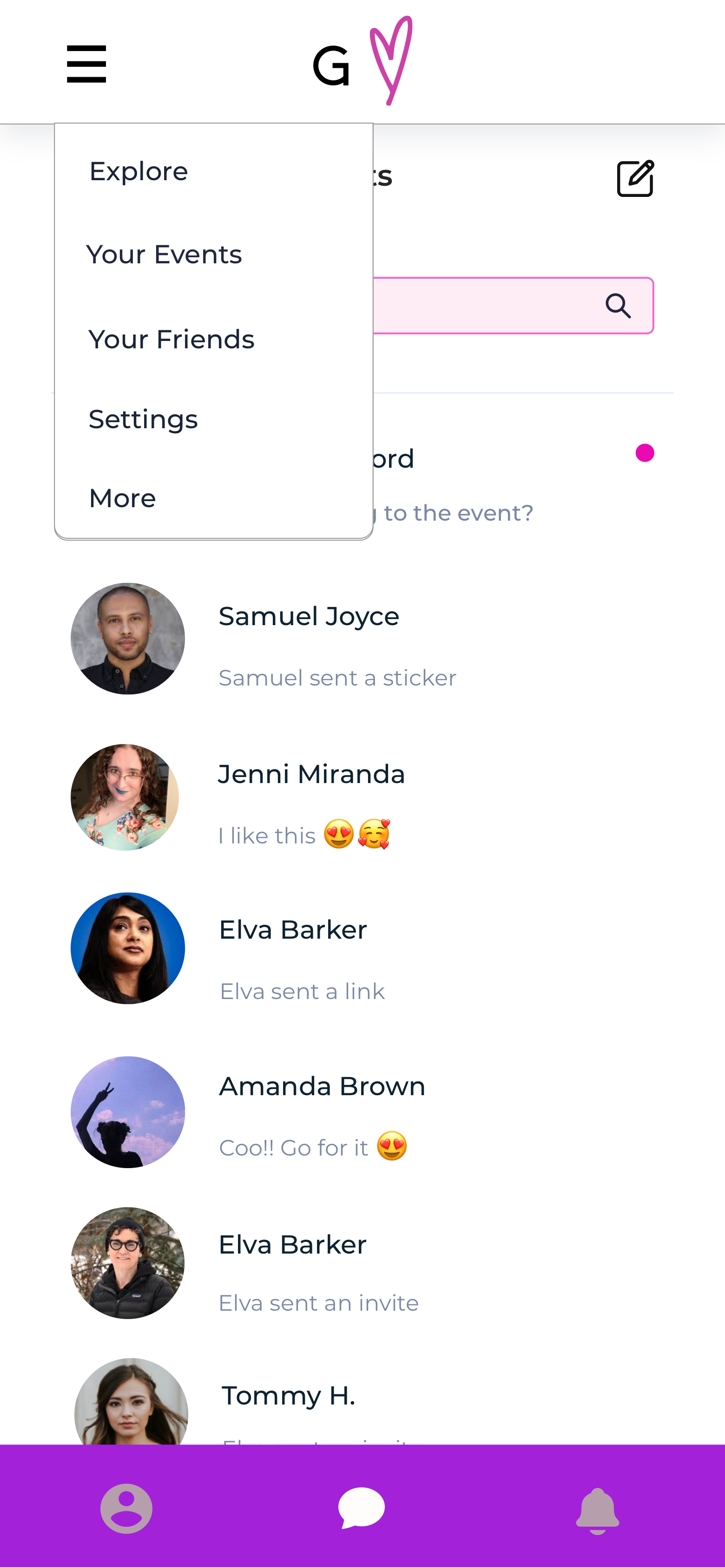
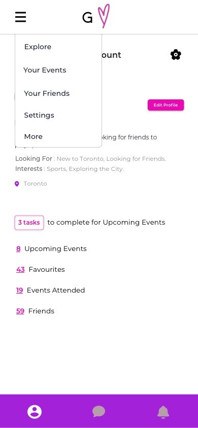
I included a detailed User Profile with an Add Friend button, as well as a Chat function prominently featured on the bottom navigation.
Users are concerned with the safety and accessibility of events.
I made logos and names of events and organizers clickable. Clicking provides clear information on accessibility and safety.

Define.
User Flow.
Through researching, two distinct user paths emerged. One user path is for looking for an event. I then focused on those who would open Gaggle for other reasons. I understood that the most frequent path would be users checking their notifications about their events and friends.
Site Mapping.
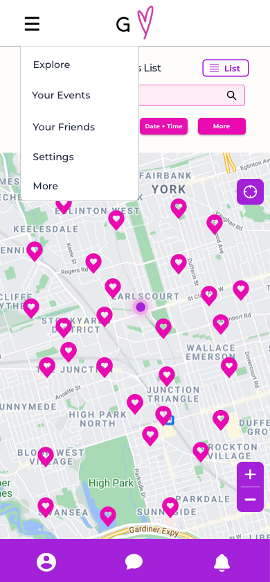
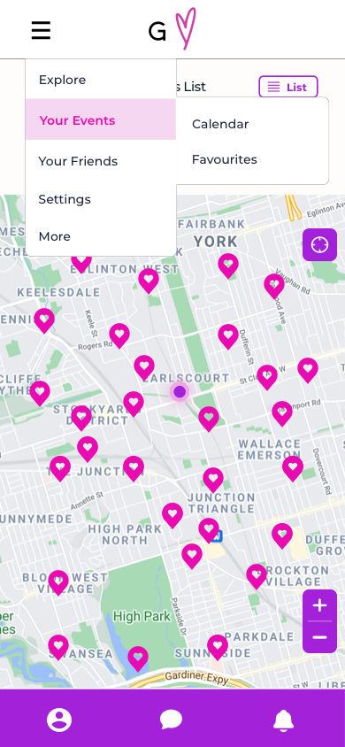
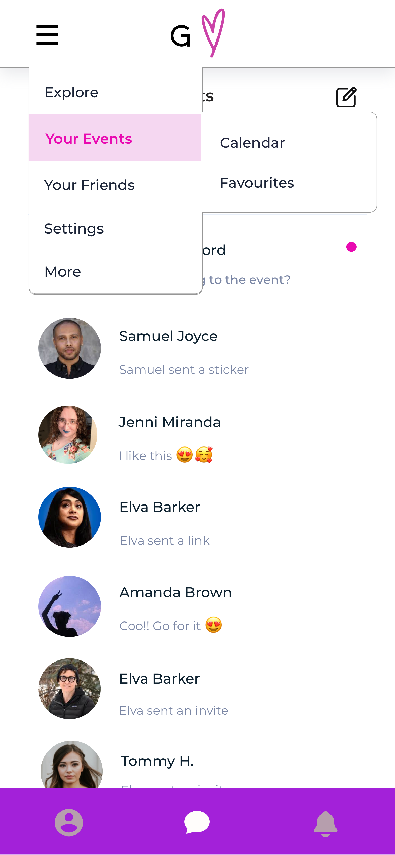
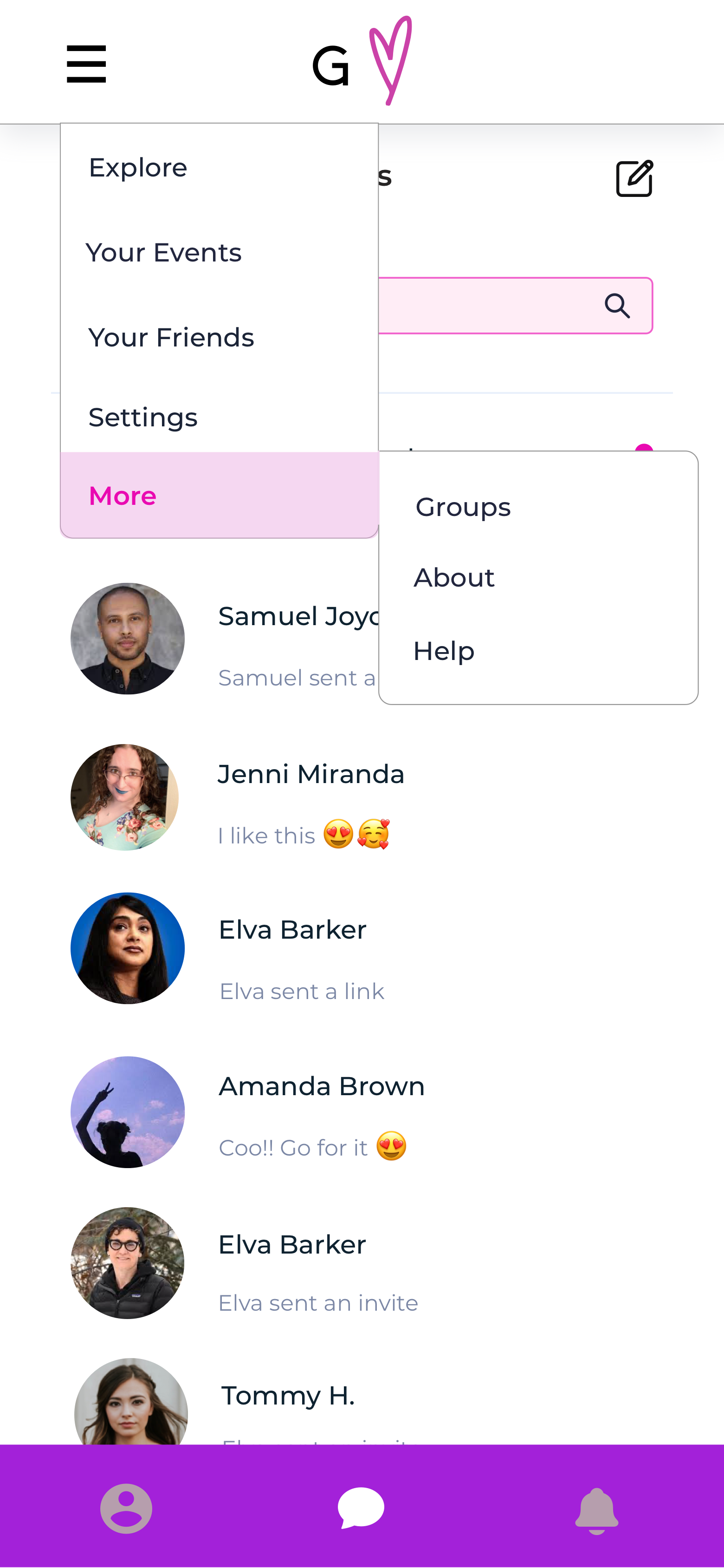
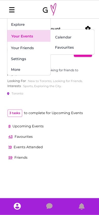
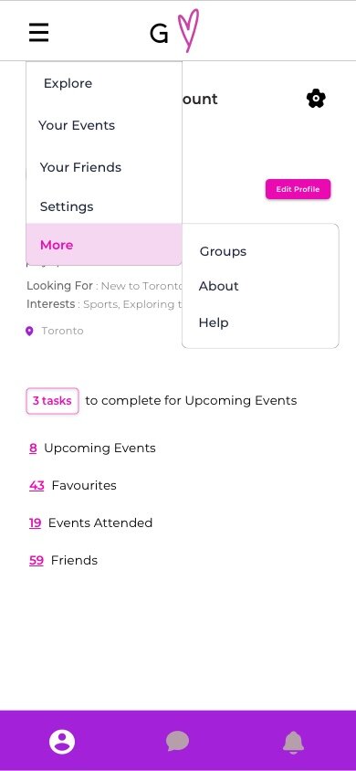
The user flow helped me understand aspects of how Gaggle’s navigation would operate. One of the user journeys led them to Notifications, while the other lead them to Explore. I had to then organize the rest of Gaggle’s features. I had learned from user testing that users highly valued the ability to connect with their friends and to be able to favourite events, so I created a Favourite and Friends section. Users also want an organized event calendar to refer to regularly, leading to the Calendar section. This all resulted in the site map below.
Design.
Low Fidelity Wireframes.
After producing the sitemap, it became clear what the most important Gaggle pages would be. As the event aspect is the most crucial to Gaggle, I created lo-fi wireframes for the home page, search page and event page.
Home Page
Event Page
Event List
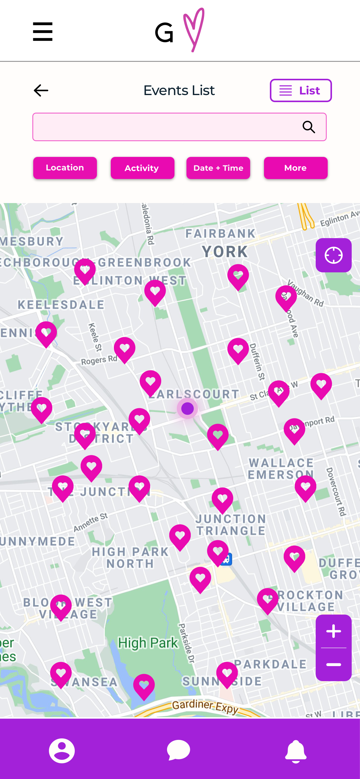
Map View
UI Kit.
I wanted to design a UI Kit that makes it clear that Gaggle is distinct from its competitors. I first created a colour palette that is joyful, friendly, energetic and queer. In making the first version of the logo, I included fingers intertwined but knew that it would be much too big for a mobile app. I then iterated off that image to make a small logo with the same message. I decided on a hand drawn heart to symbolize friendship and human connection.
High Fidelity Wireframes.
With the insight gleaned from user testing as well as my site map and user flow, I had the information I needed to create the application. With lo-fi wireframes and a UI kit that represented the intention of Gaggle , I was ready to apply them to hi-fi wireframes.
Home Page
Listings Page
Card Version
Listings Page
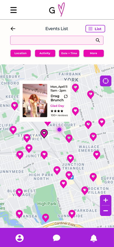
Map Version
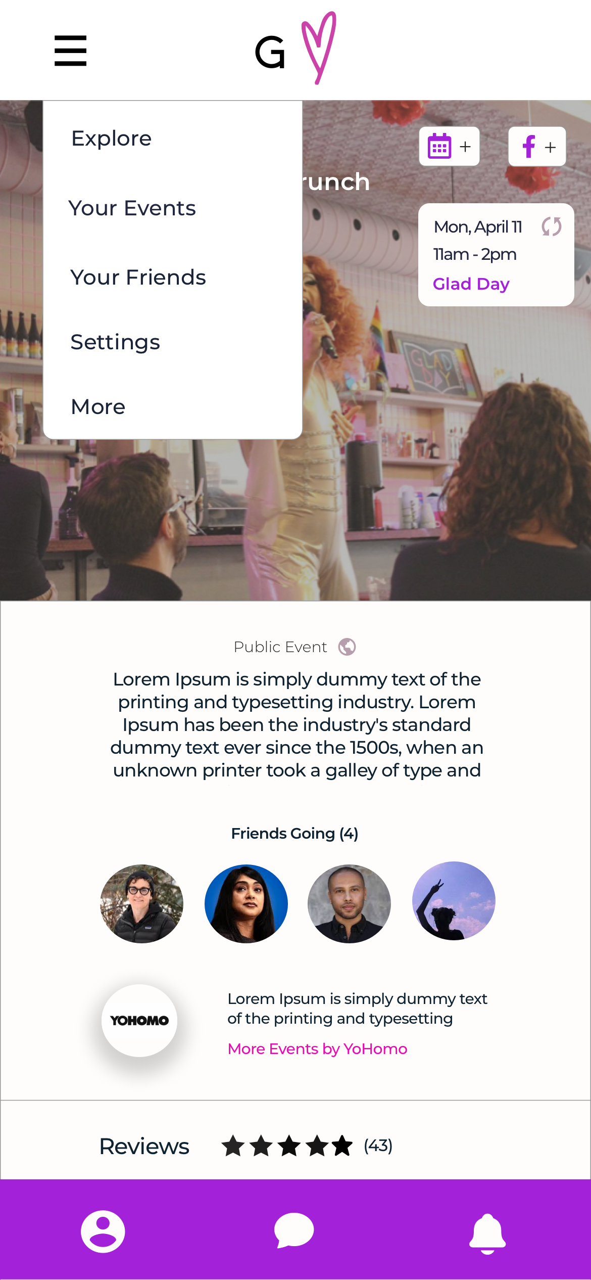
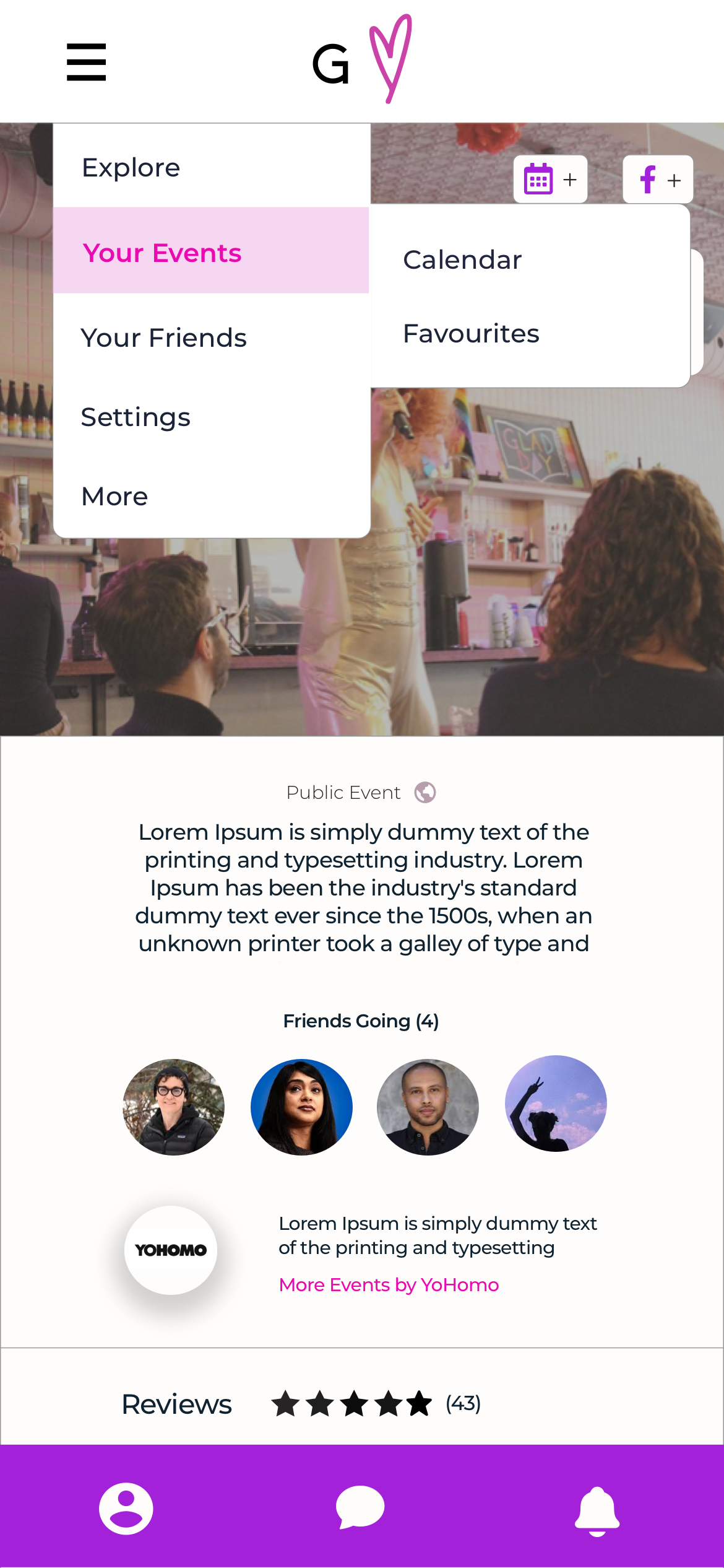
Event Page
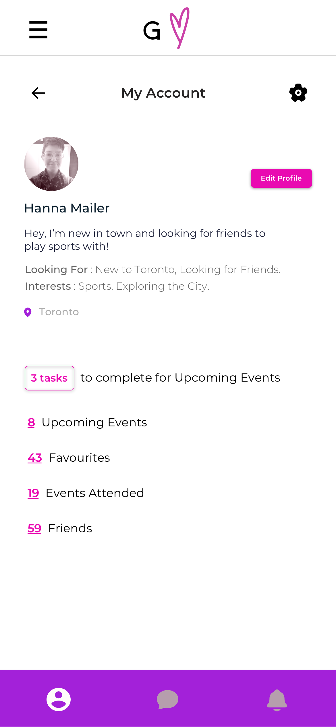
Account Page
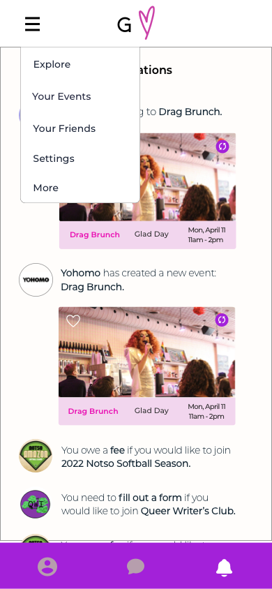
Notifications Page
Chat Page
Overview of Chats
Chat Page
Individual Chat

Prototype.
User Testing.
I created a prototype with InVision that users could interact with. I wanted the prototype to be as interactive and compelling as possible so that users would naturally engage with the platform.
Participants.
Five queer people
All have had difficulties making queer friends.
All have looked online for and joined activities in order to make queer friends.
Method.
Zoom video call with user sharing their screen
Task test: Asked user to complete the task of adding a event to their calendar.
Contextual Inquiry: The user explored the prototype and commented on the different features. They talked about additions and changes they would like.
The user tests were valuable in confirming many of the core details about the prototype. Changes made were minor and fit well within the existing prototype structure.
Most of the users tested didn’t understand that they could click on the organizers and locations on event listings.
I used shadow and colour to make them to look clickable so users know how to easily find out information about them.
Two users didn’t remember the name of Gaggle, as the logo only has a G.
I added an underline to Gaggle on front page splash so the name is reinforced.
Two users mentioned wanting to be able to see a quick synopsis of the what each user was interested in and was looking for.
I added Interests and Looking For sections to Profiles so that users can quickly evaluate similarities in potential connections.
One user mentioned wanting to have to option to make events private or public.
This was an easy addition that did not take up much room and would be useful for event makers.
Final Prototype.


