Queerit : Website Redesign Case Study
Background.
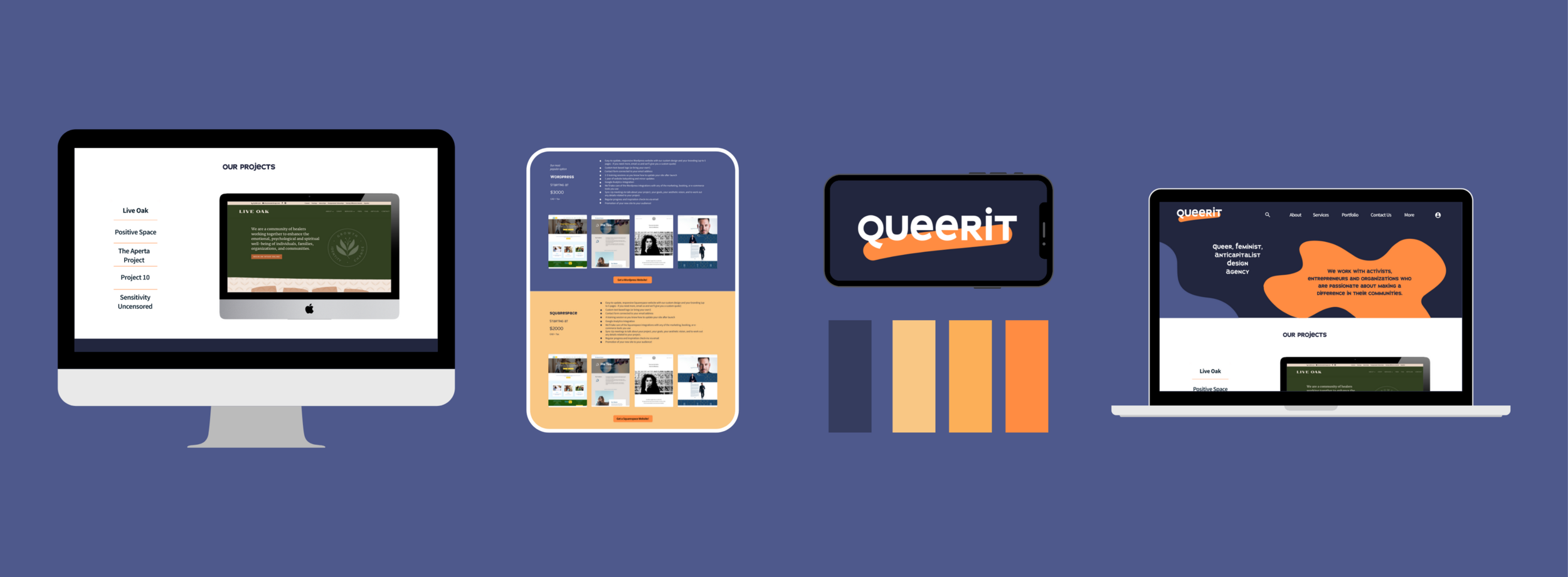
Queerit is a real web design agency that provides services for social justice-oriented organizations and companies. They asked me for a redesign of their agency website to help grow their business. They had also recently created a new brand kit and wanted help integrating it throughout their site.
My Objectives.
Create a responsive redesign for Queerit that significantly accelerates their growth, through a frictionless and fun experience.
2. Integrate their new branding to create a consistent, signature experience.
Queerit Original Website Analysis
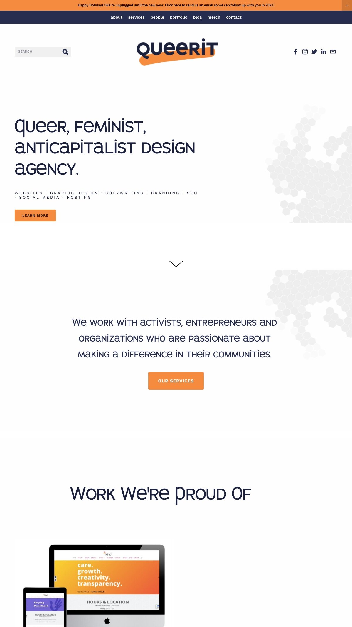
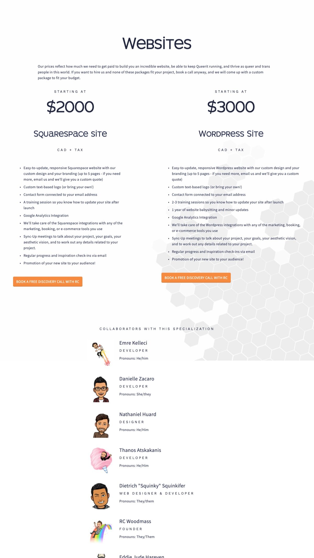
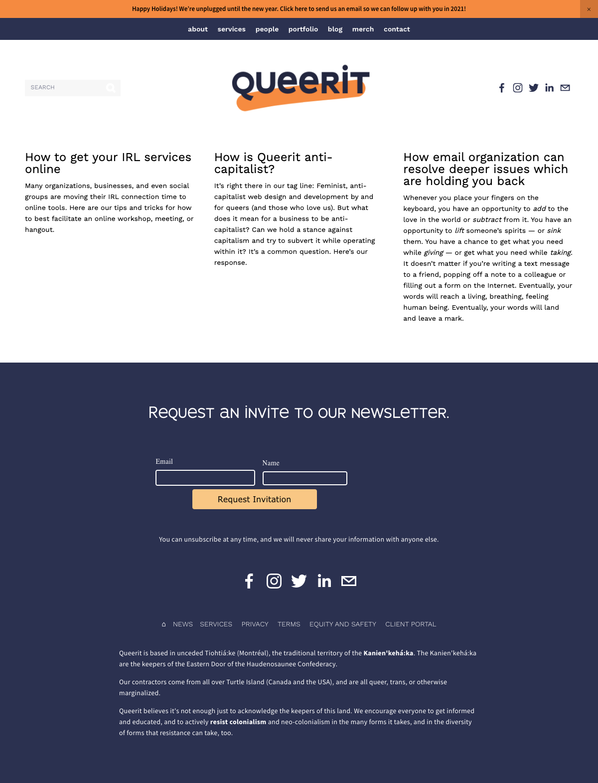
The starting point was to examine the existing Queerit website. I was able to quickly identify some areas for improvement within the design. One of the largest problems was that the landing and service pages were very long. It took a lot of scrolling to get to different pieces of information.




Research.
Direct Competitor Analysis.
I researched popular design agencies looking for how they organized their information as I realized that would be a key part of the Queerit redesign. I also wanted to see how they highlighted their work and communicated their brand message.
Some common traits in these popular agency websites were not present on the Queerit website. One example of this was that the competitors portfolios of work were generally a main focus of their home page, with easy and appealing ways to look through the images, whereas on the Queerit website their portfolio was far down their homepage and had small imagery. Another element for most of the competitors was they incorporated mechanisms to make navigating the site simple and straightforward for users. Queerit needed to incorporate some of that simplicity to create user friendly navigation.
User Testing.
Completing user testing for the Queerit redesign was great because I could use their existing website to get clear information about the ways in which it wasn’t useable. I sought out users to test that were all interested in hiring a design agency. I received lots of good, specific information from these tests, especially from the contextual inquiry and task tests.
Participants.
Four people
30 - 41 years old
One participant was actively looking for a design agency.
Three participants have considered hiring a design agency.
All participants have used website creation tools.
Method.
Zoom video call
User Interviews: User answered questions about their experiences.
Contextual Inquiry: User shared screen while they browsed Queerit website.
Task test: Users tried to find and request the service they wanted.
Stakeholders were initially unclear about specific requests or directions, but they became more clear to them as we examined the research. The data I collected was very helpful in communicating with the Queerit stakeholders the best direction forward. I created an affinity diagram to organize the information I had gleaned from users and present it clearly to Queerit.
Below is a summary of some main takeaways from the affinity map:
Users became confused as they browsed the long landing and services pages.
Reduction in scrolling time on each page is essential. This can be achieved by reducing whitespace and putting non-essential elements on separate pages.
Users didn’t understand where the portfolio images were. Once found, users commented that they should be at the top that the images should be larger.
The portfolio images on the landing page have to be seen right away, so should be closer to the top. To save on space, they can be featured one at a time, with the user being able to switch between images.
Users found the collaborators being listed on the landing and services pages very confusing. Some thought they had to contact the individual collaborator to get services, which is untrue.
The collaborators information needed to be put on separate pages from the landing and services page. They should be easy to find in the top navigation.
Users lost track of the top navigation area and became disorientated.
Shorter pages will help users keep track of the top navigation. The floating navigation bar can also follow user as they scroll.

Empathize.
Persona.
With user testing complete and the findings compiled and organized, I noticed there were a lot of commonalities among the users tested. I compiled a persona with these commonalities and referred to it often throughout the design process, which helped ensure that the user experience was at the forefront of the design.

Define.
Site Mapping.
Through the research stage it became clear that Queerit needed more pages and categories in order to make each page shorter and easier to understand. This meant determining the best methods for reorganization and categorization of information. In order to do so I created a sitemap to follow while designing the wireframes.
Design.
Low Fidelity Wireframes.
The Queerit stakeholders were provided with the deliverables I had presented as well as a few quick sketches of possible lo-fi wireframe templates. They were then able to give me more specific information and requests about what they wanted. For the landing page this included requests for vertical scrolling for viewing portfolio images, and a mosaic of the categories of services provided by Queerit. The services and contact us pages were chosen from the provided sketches without further alterations.
Landing Page
Desk/Laptop
Landing Page
Mobile
Landing Page
Tablet
Services Page
Desk/Laptop
Contact Page
Desk/Laptop
UI Kit.
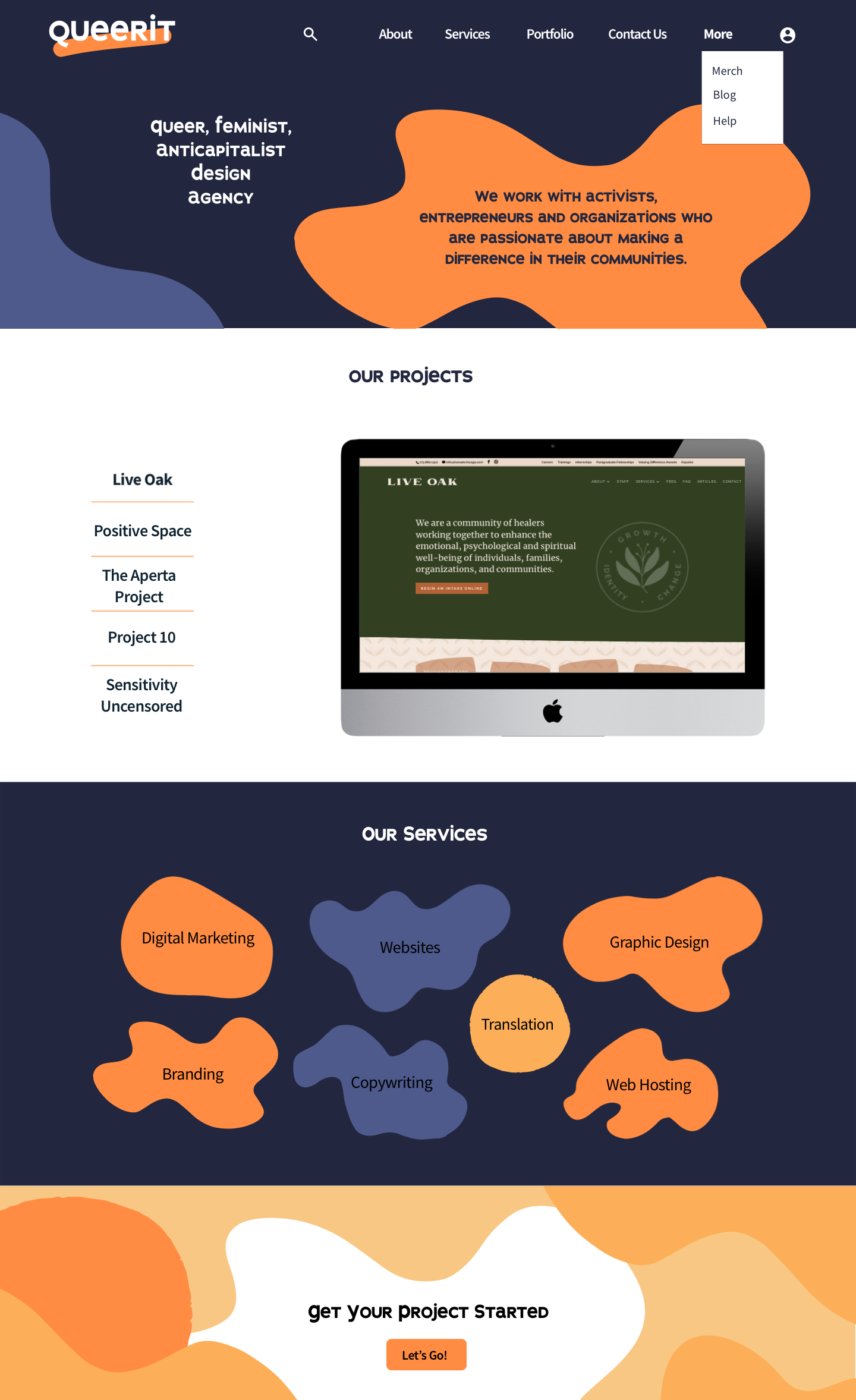
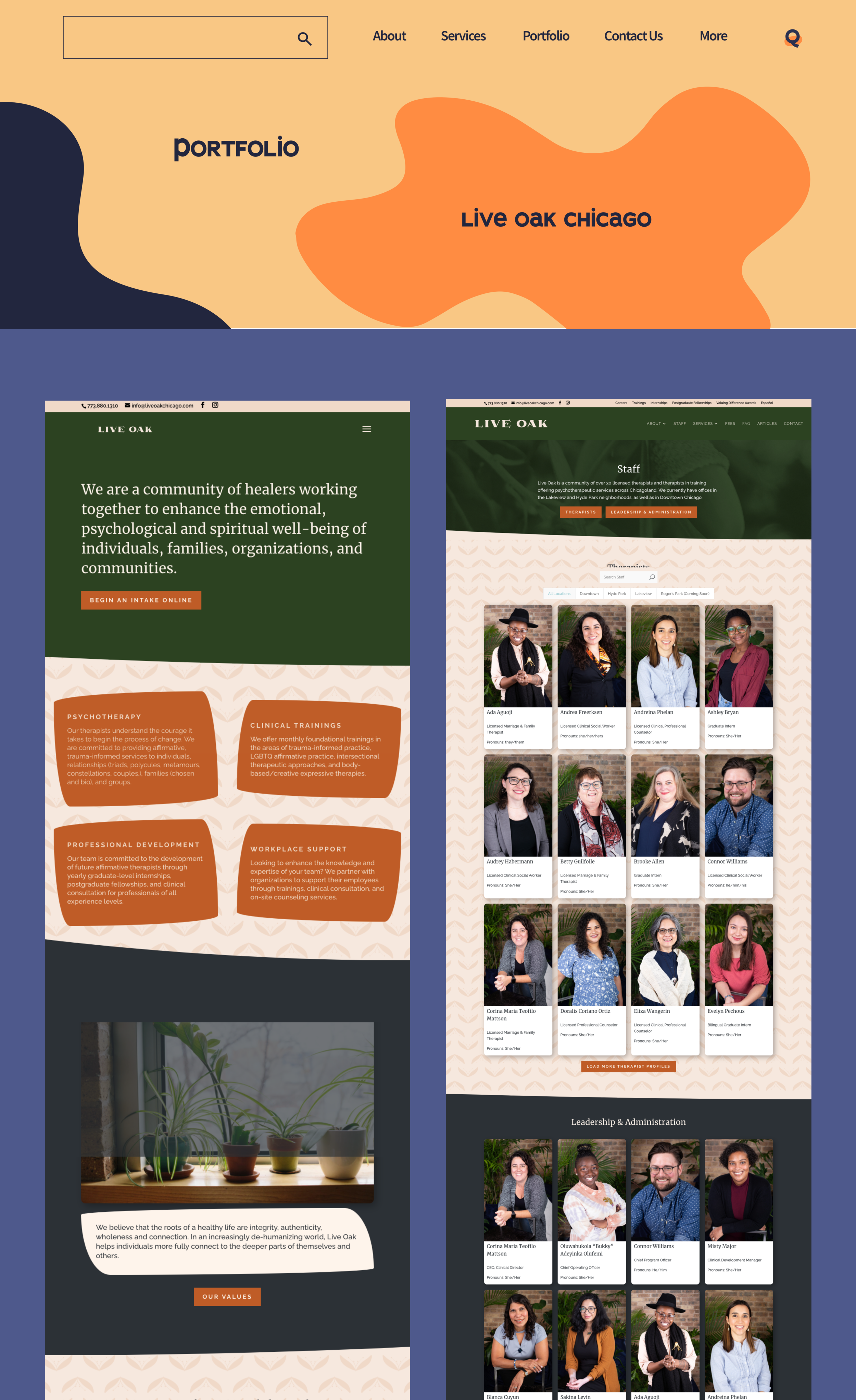
The logo, colour palette and fonts had already been selected by Queerit for their rebranding. The main task was to determine how the responsive navigation bar was going to look and behave. Queerit stakeholders requested that the top navigation not be seperate from the hero area on desk/laptop. In creating their site, the top navigation would change to a seperate bar as the user scrolled.
High Fidelity Wireframes.
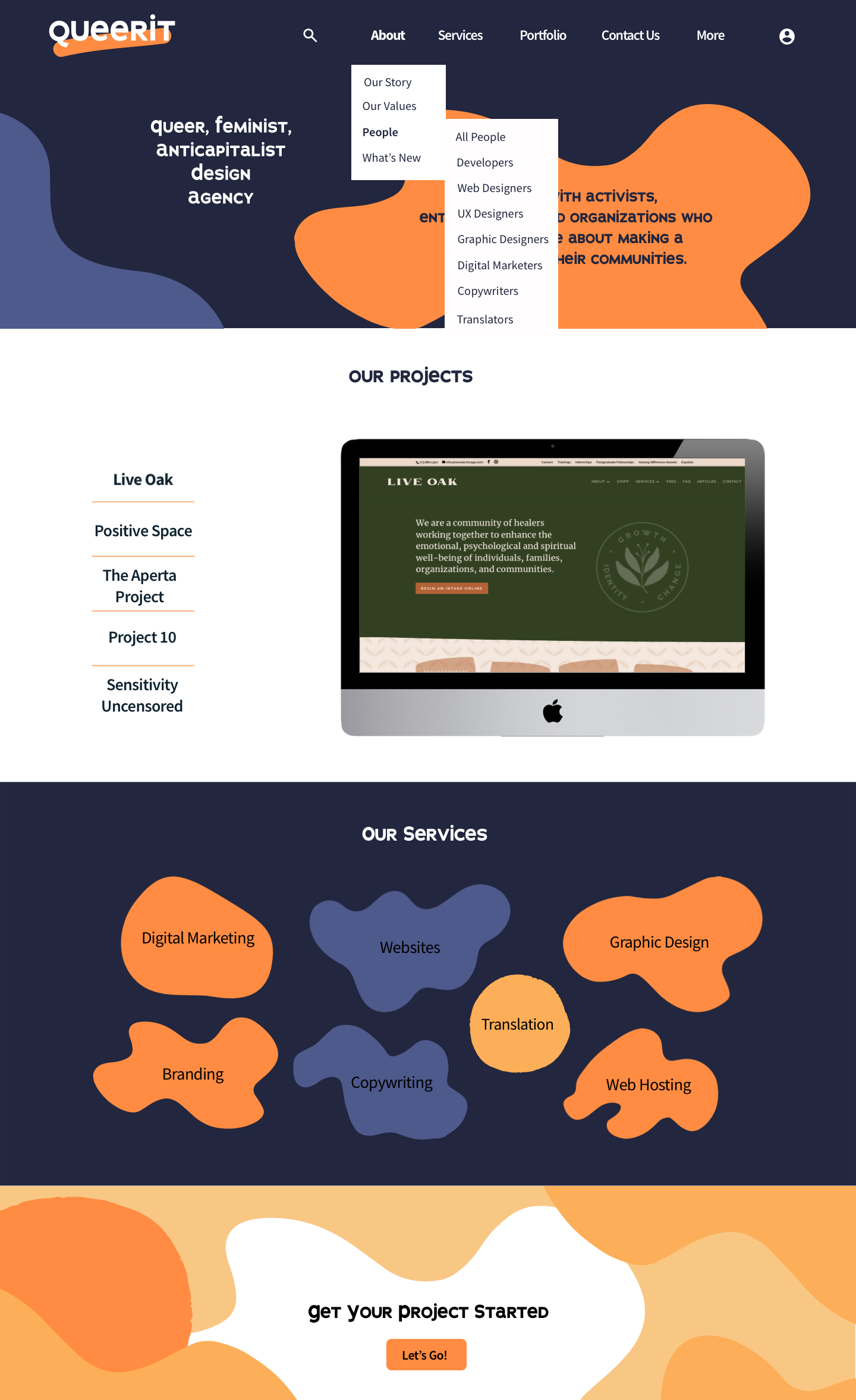
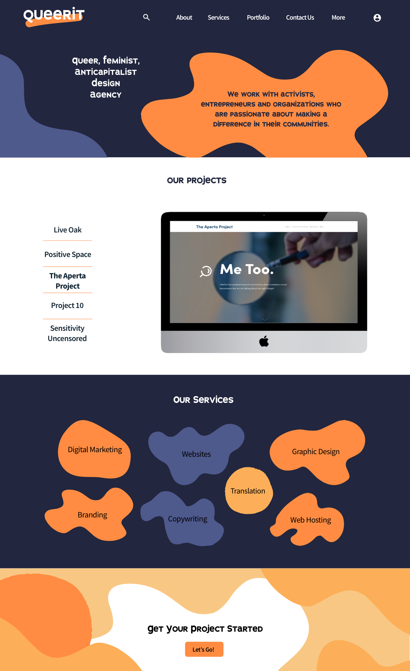
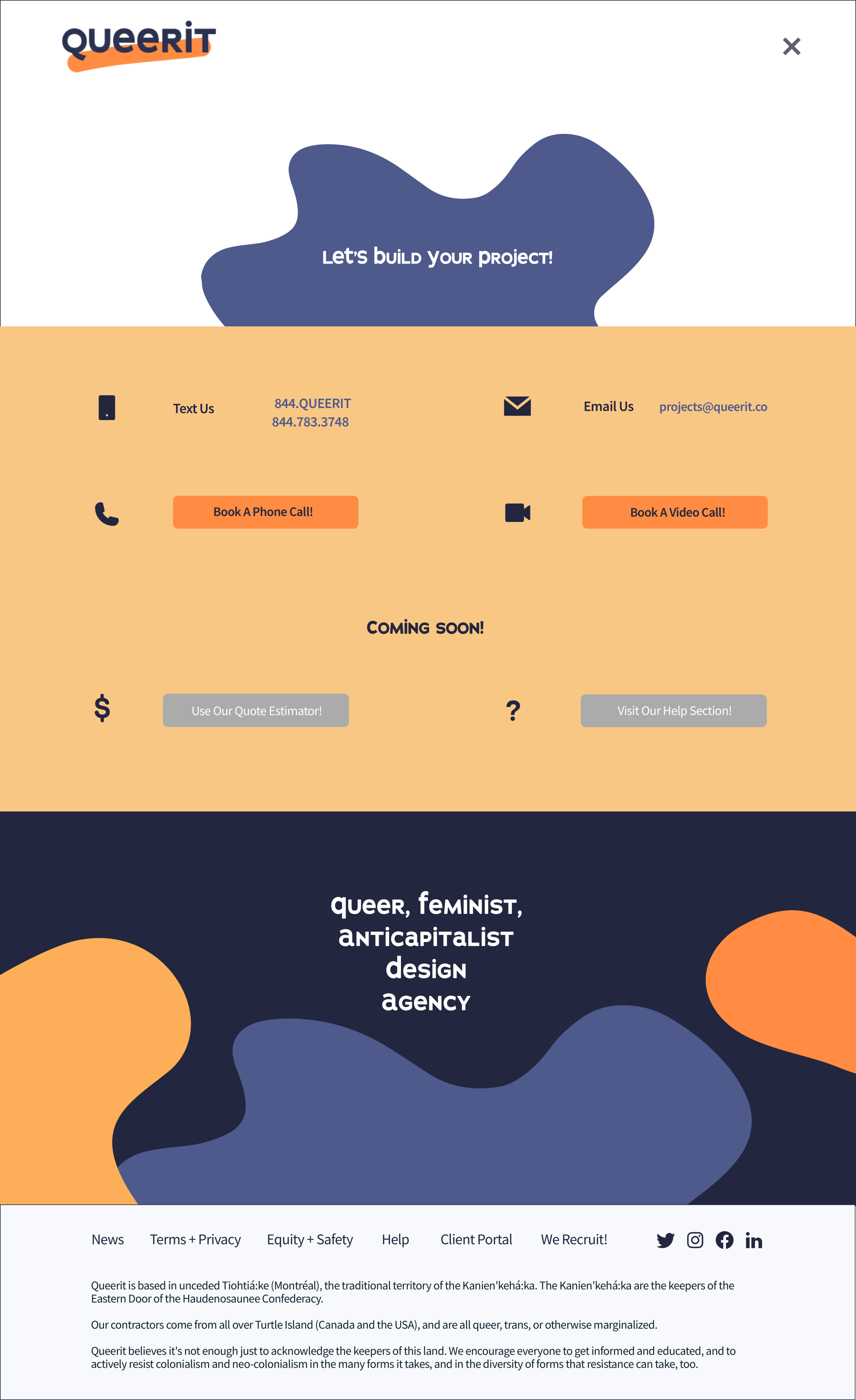
Queerit stakeholders played a large role in the decisions made that are reflected in the final wireframes, including having very little white anywhere and instead filling the majority of the whitespace with their brand colours. They requested lots of ‘blobs’ to saturate the headers, footers and for the landing page mosaic to be made of blobs. They also requested all scrolling to be vertical and for the top navigation to not be separated from the header.
Landing Page
Services
Page
Portfolio Page
Contact Page

Prototype.
User Testing.
After creating a clickable prototype for user testing, I was excited to see users interact with and improve the prototype. As with the last user test, only users that have considered web agency services participated. Users completed a task and looked through the prototype while I asked them questions.
Participants.
Four people
28 - 41 years old
All have considered web agency services.
Method.
Zoom video call with user sharing their screen
Task test: Asked user to complete the task of finding website creation services and booking them.
Contextual Inquiry: The user explored the prototype and commented on their experience with the different features. They pointed out additions and changes they would like.
I gained a lot of great insights from user testings. Below are some of my main observations:
Users were not able to see the entirety of all the hero areas and the mosaic landing page area without scrolling. They also were not sure if there was more content below the area.
All the hero areas and landing page mosaic need to be smaller so that the whole area plus some of what is below it can be seen on one screen.
Users tried to click on the entire area when selecting types of websites on the services page.
Create larger clickable area for each of the categories on the service page.
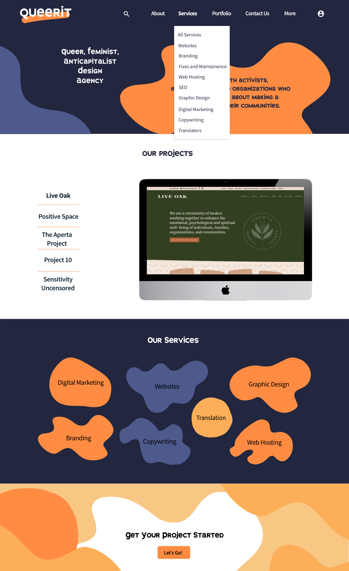
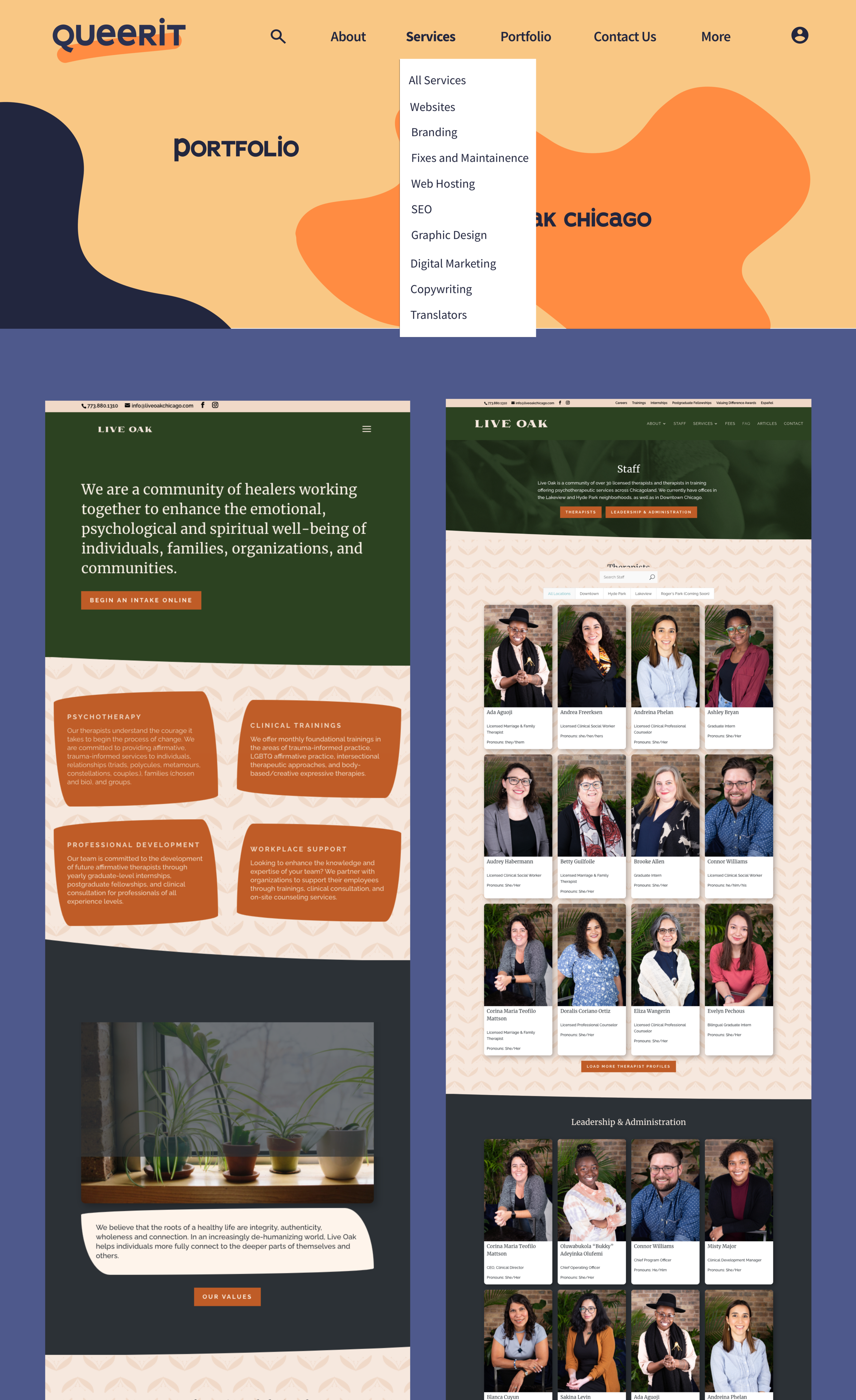
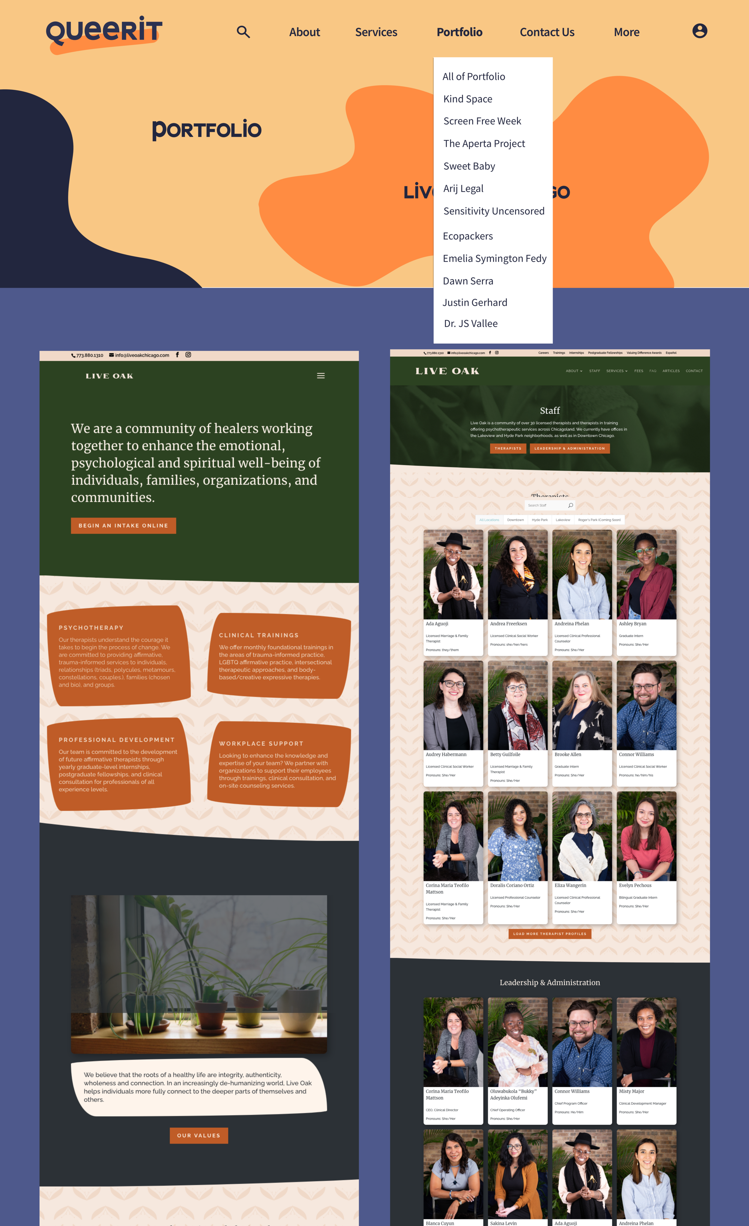
Users were unsure which option they wanted to click in the drop-down navigation, especially for browsing Queerit’s portfolio items.
Add an All option for in About, Portfolio and Services categories on the navigation bar.
Users felt confused about what they were looking at when there wasn’t the specific name of the portfolio item in the hero on the portfolio page.
Add a title to the portfolio area of the landing page.
Final Prototype.
