Spotify Karaoke : Adding a Feature
Background.
Karaoke is a globally popular way to share in the joy of music. However there is a lack of a streamlined virtual way to do karaoke. This is especially important because virtual karaoke would make karaoke more accessible. Spotify, as a global music hub, is the perfect place for a karaoke add-on feature. This would also have the added benefit of expanding Spotify’s social capabilities.
My Objectives.
To create a digital social karaoke experience that combines the best of traditional karaoke with the expanded possibilities afforded by technology.
2. To integrate a karaoke feature into the Spotify environment that fits seamlessly into the logic and design of Spotify.

Research.
Direct Competitor Analysis.
Though there aren’t many karaoke apps, I was able to find some. I also looked at Apple Music, as though it isn’t a karaoke app, it is a musics streaming service where you can at least because Looking through virtual karaoke app options reveal that there is lots of room for improvement.
Almost all of the competing apps surveyed only allowed the user to do karaoke by themselves or with one other person. The only app that had a video chat and allowed 3+ people is Houseparty. All the platforms had very limited song libraries, without access to original recordings. Spotify karaoke would have a very large karaoke catalogue with potential to access original recordings from artists. Spotify also has the advantage of ease of use through familiarity and ease of inviting others through popularity.
Primary Research.
Finding Houseparty was important for user testing, as it is the closest approximation of what I wanted to make. Testing users while they used Houseparty helped shape what my Spotify app prototype through the user’s revealing strengths and weaknesses of the app. I found user volunteers that were all karaoke fans who also used music streaming services.
Participants.
Seven people
All use music streaming services
All have done virtual karaoke.
Method.
Zoom video call
User Interview: User answered questions while I took notes and recorded.
Contextual Inquiry: User shared screen while they completed tasks and looked through Houseparty.
The gained lots of insights from user testing. Users were mainly concerned with what parts of in-person karaoke that they considered essential and weren’t present in Houseparty. My most important takeaways are the points below.
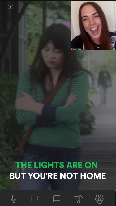
Users missed the cheesy background visuals that accompany lyrics in karaoke bars.
Add amusing karaoke videos to add visual interest.
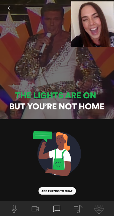
Users want communicate to the individuals not singing as well as the whole group during a song.
Create a text chat mode so that users can enable to communicate, either to individuals or to the whole group, while another user is singing.
Users wanted to be able to see all user videos of karaoke attendees while a user is singing, to see all their reactions.
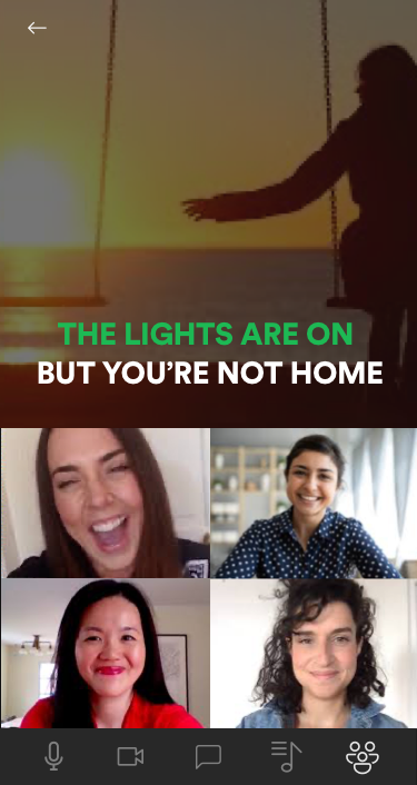
Create a video chat mode in which you can see all karaoke attendees videos while a user is singing and otherwise.
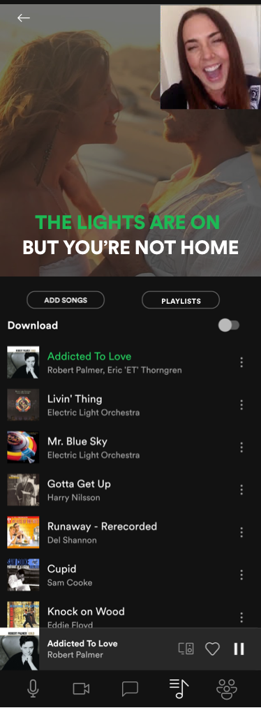
Users felt there wasn’t enough songs available on Houseparty. They also wanted to see a public playlist of what users have sung and what songs are coming up, which wasn’t available on the app.
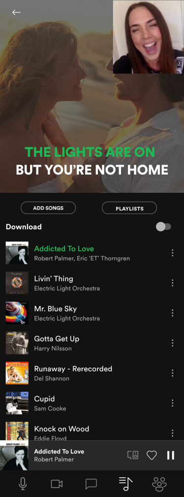
Spotify karaoke should have a very large catalogue to choose from. There should also be a mode users can enable to see the karaoke session’s playlist.
Users appreciate that there is favouriting available on Houseparty.
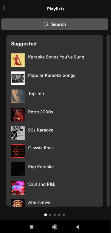
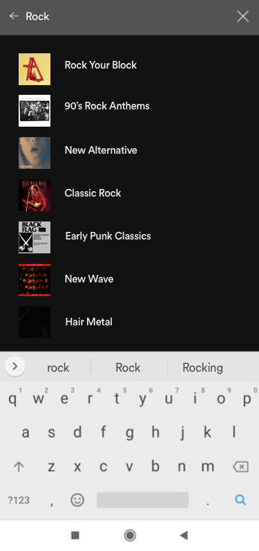
Make it so that users can add songs to specific karaoke lists. Users will be able to access their saved songs and playlists as well as curated Spotify-made karaoke playlists during a karaoke session.

Define.
User Flow.
I made a user flow chart to see what order different features and screens would come up in the karaoke feature and how user behaviour would effect that order. I made two different user journeys in the user flow to understand what would happen if a user wanted to start a karaoke session or to add songs to a karaoke playlist for later.

Design.
Low Fidelity Wireframes.
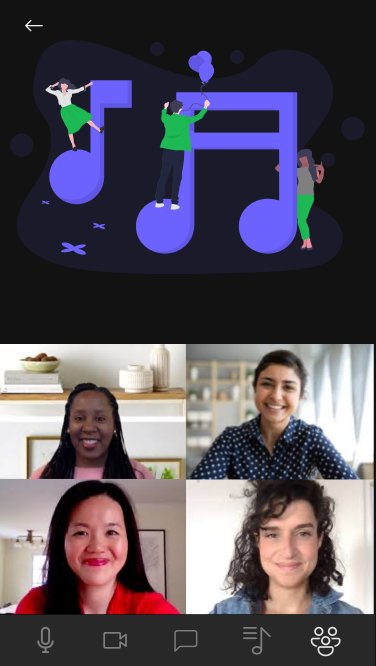
I made lo-fi wireframes for primary aspect of the karaoke feature which is the home page. I made four wireframes with the home page’s different modes activated. The different modes are enabled and disabled from a bottom floating navigation bar. The user can select and deselect a neutral state, chat state, user video state and playlist state as well as turn their microphone and video on and off.
Home Page
Neutral
Home Page
User Videos Activated
Home Page
Chat Activated
Home Page
Playlist Activated
High Fidelity Wireframes.
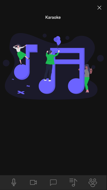
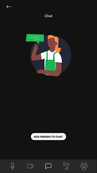
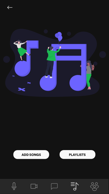
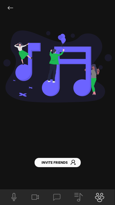
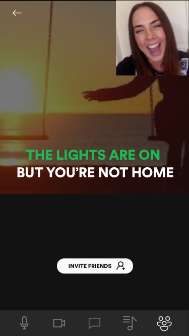
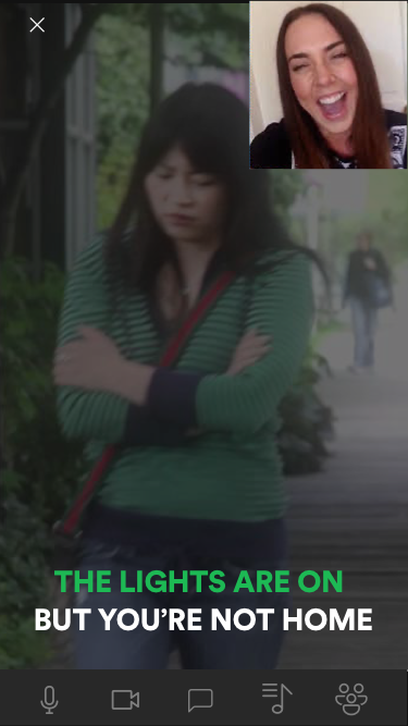
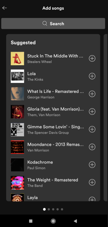
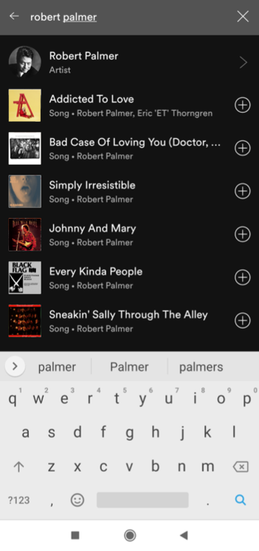
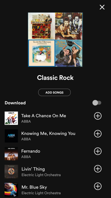
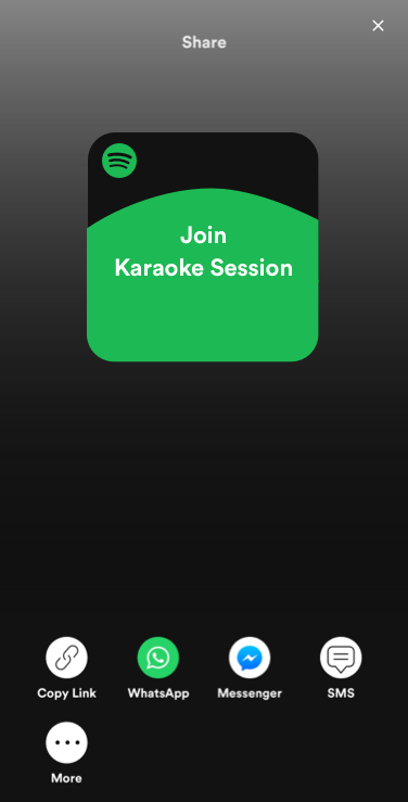
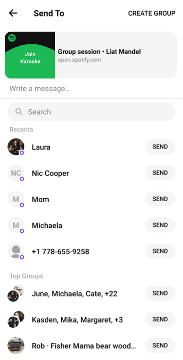
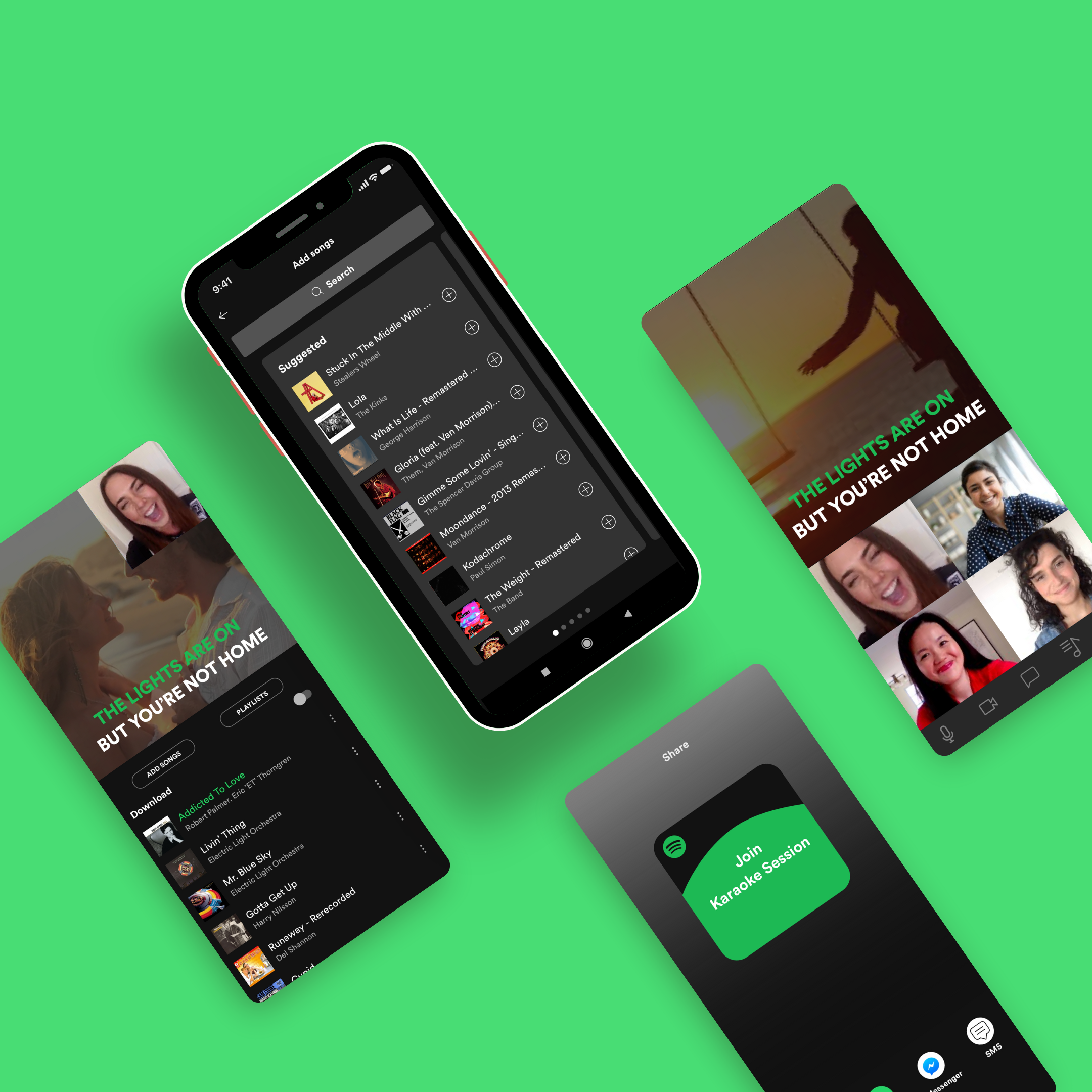
I followed the publicly available Spotify UI kit in order to keep the karaoke feature branding consistent with the rest of the Spotify app. I applied the kit to my hi-fi wireframes. I also created new pages for selecting songs and inviting friends to a karaoke session.
Home Page
Video Call Page
Chat Page
Playlist Page
Add Songs Page
Add Friends Page

Prototype.
User Testing.
I created a clickable prototype for users to fully explore all the aspects of the Spotify karaoke feature. User tests went smoothly, in part because I had integrated all of the features into the Spotify model and all the users tested knew how to use Spotify. There also wasn’t a lot of changes needed to enhance the Spotify karaoke feature.
Participants.
Four people
All use Spotify to stream music.
All have done virtual karaoke.
Method.
Zoom video call with user sharing their screen
Task test: Asked user to access karaoke feature. Then users were asked to add songs and other users to their karaoke session.
Contextual Inquiry: The user explored the prototype and commented on their experience with the different features. They added additions and changes they would like.
Although more limited than my first round of user tests, below are the main takeaways I got from the second round .
Users looked for a back arrow icon on the top left of the screen, rather than clicking through the bottom navigation icons to get back to where they were previously.
I added back arrows to go back rather than only using bottom navigation icons.
When interacting with the songs and playlists pages and the invite pages, users looked for an X in the top right hand corner to take them back to the home page.
I added Xs on the add music and invite users pages to go back to the home screen.
Final Prototype.
